The manuscript is finished. The sentences have been attended to, the plot has stopped leaking and the last surviving typo is maintaining a low profile until publication day.
You open Word, change the page size and discover that chapter eight now begins halfway down a page beneath somebody else's running header.
Welcome to production. You thought the difficult character was in the novel. It turns out to be the document.
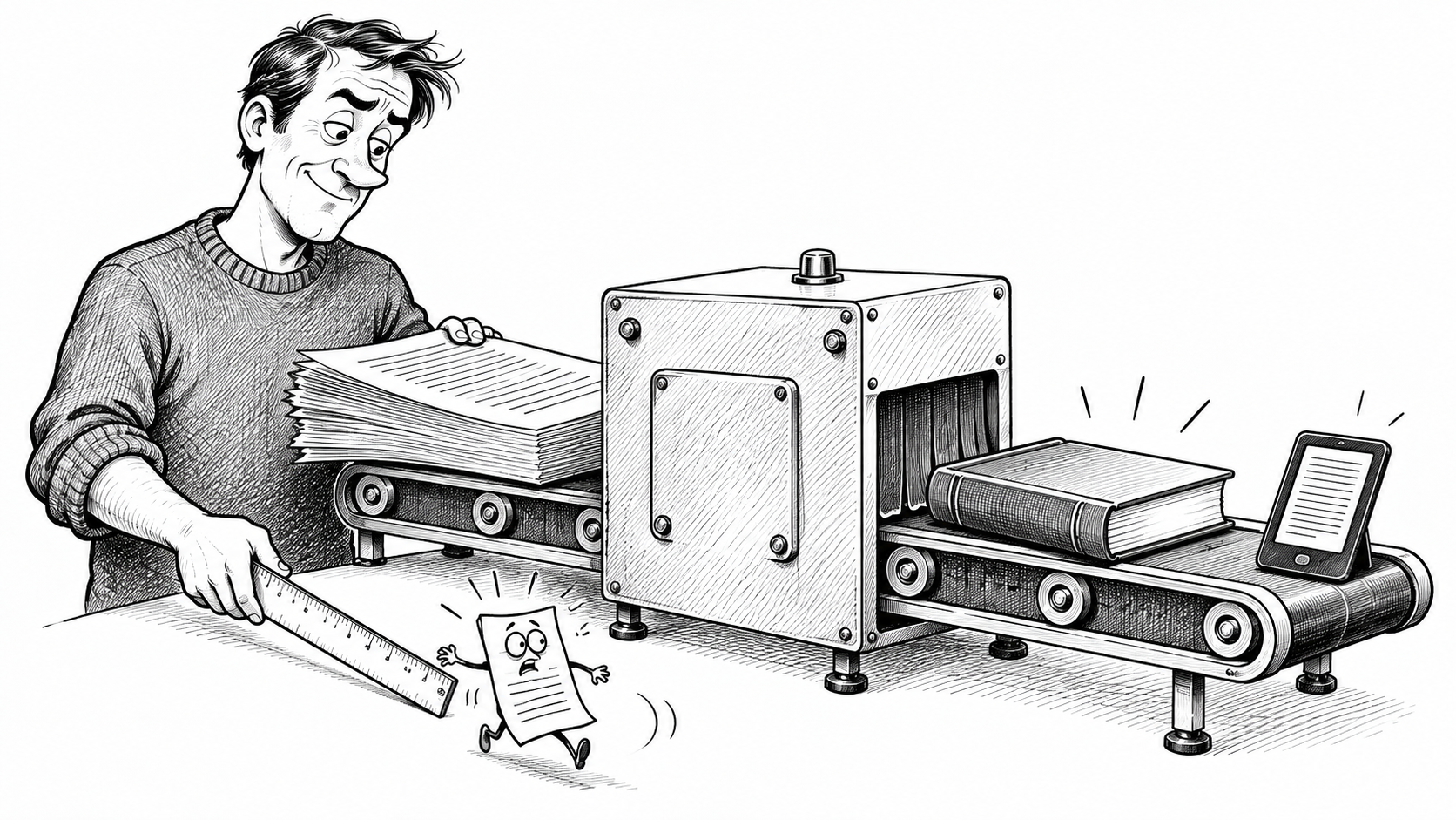
A finished manuscript contains the book. It is not yet the finished object a reader will hold, or the ebook they will enlarge on a small screen because they would quite like to see the words they bought. Those editions require decisions about shape, space, navigation and presentation. Some decisions are conspicuous. Others become conspicuous only when somebody gets them wrong.
Our earlier article, So You Finished the Book. Now What?, introduces the wider publishing job. This is the part where the actual files begin expressing opinions. Several are strongly held, and none was requested.
The manuscript says “The End”. Word regards this as an opening position.
The publisher was here before you finished
Tony Marturano, the author-publisher I work with, rejects the idea that the writer leaves the room at the final full stop and the publisher arrives carrying a ruler. In independent publishing, both have been there all along.
He thinks about the finished reading experience while writing: how an in-world document might look, where an image belongs, what a visual detail contributes. The text matters, but so does the form in which the reader encounters it.
There is a commercial calculation too. More pages can mean higher manufacturing costs. KDP's current printing-cost guidance makes page count and print choices part of the calculation; a manuscript does not acquire free paper simply because the additional scene is emotionally necessary.
In Tony's own publishing experience, some printed copies have returned as little as a few dozen pence, or under £1, after manufacturing and retailer or distribution costs. Those are examples from his experience, not a universal current rate. The amount depends on the edition, price, sales route and applicable terms. The reader sees the price on the cover. The author sees what survives the journey through everybody else's till. Occasionally it is enough to develop a meaningful relationship with a parking meter.
That is a reason to understand the object you are making. It is not a reason to shrink the type until the novel resembles the conditions on a medicine bottle.
First, give yourself something clean to go back to
His first production action is magnificently undramatic: make a copy. Nobody has ever applauded this advice at a publishing conference. Several people have wished they had followed it.
Keep the final, polished manuscript intact. Create a clearly dated production copy and work there. The next phase may involve changing styles, removing formatting debris, rebuilding sections and discovering which innocent-looking setting has been holding six chapters together.
Version history is useful. So is a pristine file whose identity does not depend on remembering whether the good version came before or after the afternoon everything went sideways. A folder containing FINAL, FINAL2 and FINAL_USE_THIS_ONE_REALLY is less a filing system than a statement taken after an incident.
This is also where restraint matters. Removing unwanted formatting must not remove wanted meaning. Italics, scene divisions and distinctions between ordinary prose and a letter inside the story still belong to the book. Cleaning the file is not permission to put the entire manuscript through a car wash and inspect the remaining characters afterwards.
Keep a clean master. “Undo” is a button, not a disaster-recovery policy.
Choose software you can control
Book-production advice can become surprisingly religious about software. Ask how to lay out a novel and somebody will explain that serious people use a particular application, with the weary certainty of a man discovering you have been eating soup with the wrong family crest.
Tony has tried InDesign several times. He recognises its strengths for sophisticated page composition and the integration of text and graphics. He has not enjoyed working in it, and for his mainly text-based novels he finds his controlled Word workflow more effective.
That is a judgement about his work and skills. It does not establish that InDesign is unnecessary for everybody, or that Word has secretly become effortless typesetting software.
Word is a word processor. Making it produce a professional book takes knowledge and control. Equally, in his experience, importing a manuscript into InDesign does not eliminate formatting faults or the need to repair them. A more expensive application can provide better tools without volunteering to learn them on your behalf. Paying monthly for the privilege of feeling inadequate is widely available; it need not become part of your production plan.
Choose according to the demands of the book and your ability to achieve the result. If neither your skills nor your available time can support the job, hire someone whose can. Readers will see the pages. They are unlikely to request a screenshot of your software subscription.
Build a design that can repeat itself
Typesetting is more than making a page look vaguely bookish.
You decide the physical page size, margins and space at the binding. You decide how body text behaves, how chapters begin, what appears in the headers and footers, and how front matter, main text and back matter relate. Typefaces have roles. Spacing has a reason. A chapter opening should not depend on how many times somebody happened to press Return.
In Tony's Word process, this is a controlled rebuild. Old local formatting can keep interfering with new decisions: a heading resists alignment, a paragraph develops an unexplained gap, a font returns after apparently accepting its dismissal. Word has kept its security pass.
Consistent styles give repeated elements a common treatment. Without them, each chapter becomes another opportunity to reconstruct yesterday's decisions approximately. The result may be a book in which every opening looks individually considered, chiefly because none looks like the others.
A drop cap makes a useful small example. It looks like a decorative flourish until a chapter begins with a quotation mark. Now somebody has to decide how punctuation and the enlarged initial should work together. The flourish has acquired a meeting. By lunchtime, three adults are discussing whether a quotation mark should be bigger. This is why publishing must occasionally remind itself that it is an art.
None of this requires elaborate decoration. A restrained interior can be excellent. What matters is that its decisions are intentional and consistently applied.
One small formatting change: because apparently chapter twelve was too settled.
Ask what the fix just moved
The most dangerous phrase in production is “I'll just fix this one thing.”
A paragraph gets slightly longer. A line falls onto the next page. The chapter ending moves. A later opening that was behaving perfectly well begins loitering somewhere unsuitable. You removed one hyphen. Chapter twelve has interpreted this as permission to relocate.
Tony checks justified spacing, hyphenation, page breaks, chapter starts, blank pages, font consistency and headers and footers. He personally dislikes visible hyphenation and often works to reduce it. Plenty of professionally produced books use it; his dislike is a design preference, not a warrant for confiscating their ISBNs.
The important question is what happens after the adjustment. Did the local improvement disturb the flow elsewhere? Has removing one awkward line created a worse page ending?
Page and section breaks need deliberate handling. Different parts of the book may need different numbering or header treatment. Microsoft documents how sections and header links control those differences. They do not make nearby edits consequence-free, but they give the document a structure you can manage.
Inspect the resulting layout beyond the paragraph you touched. The scene may still end in a shocking revelation; it should not acquire a second one because the next chapter title has vanished.
Three editions, three sets of decisions
For his paperback, Tony prepares a deliberately typeset PDF. The layout belongs to the selected size and geometry. It is the edition he has designed, rather than a manuscript waiting for a conversion service to decide where everything should land.
For a hardback, he copies the perfected paperback Word file and adapts it. The styles and much of the work remain useful. Where the geometry changes, however, the text can reflow, so chapter openings, breaks and page endings need another inspection. Reusing the work is sensible. Assuming the result is already checked is a small act of optimism with several hundred pages attached.
He generally includes a hardback because he likes the feel, durability and presentation. That is his preference, not an obligation to manufacture one for every title.
The ebook asks a different question. A reflowable novel responds to the reader's display settings instead of preserving each print page. Amazon's reflowable-book guidance explicitly allows text and formatting adjustments. Your beautifully balanced print spread cannot insist on remaining intact when somebody enlarges the text. The reader has bought a book, not entered into a binding agreement with your margins.
Tony therefore prepares an ebook-specific Word source, removing print furniture and rebuilding the structure for digital reading before bringing it into Kindle Create. He gives particular attention to chapters, navigation, front matter and images. For more complex visual material, he prefers adding it deliberately within Kindle Create rather than relying on the Word import to carry everything through as intended.
Amazon's current Kindle Create guidance supports DOC and DOCX imports, proposed chapter recognition, a navigable contents structure and image handling. Those facilities help; they still leave you responsible for checking what the software recognised. A machine confidently identifying the wrong thing remains a machine identifying the wrong thing. Confidence is not proofreading.
Kindle Create also offers a combined ebook-and-print route. Preparing editions separately is his method for controlling the result, not a claim that shared-source tools do not exist. The requirement that survives either approach is to inspect each edition on its own terms.
Use the available preview controls to examine different device layouts, text sizes and navigation. A conversion that finishes successfully has completed a conversion. It has not supplied an independent opinion on whether chapter eleven is accessible.
“Conversion successful” means the software has finished. The book would like a second opinion.
Proof the words, then proof the object
Tony prefers checking text in PDF. He can zoom, annotate, share and inspect it without accumulating the sort of paper pile that eventually needs its own postcode. He does not regard a printed sheet as inherently more virtuous for proofreading.
For the manufactured book, he wants a physical proof.
These are different questions. Is the text and layout correct? And what has the printer actually made from the files?
Colour is an obvious place for expectations to come unstuck. Your screen presents luminous colour; printed material reflects light. Tony has received print-on-demand covers that appeared darker or flatter than expected. That is his experience, not a guarantee that every cover needs indiscriminate brightening.
KDP's current paperback-cover guidance recommends CMYK images, warns against mixed colour spaces and acknowledges manufacturing colour variation. Following the specifications helps; it does not make a monitor a sample of the finished cover. The screen has a light behind it. Your paperback will have to manage without one, unless the reader has made a very serious storage error.
Examine the physical alignment too. Does the spine look right? Is important imagery crossing a fold awkwardly? Does the design work when the object is closed, opened and handled, rather than lying perfectly flat inside a preview window?
KDP describes proof copies as pre-publication test copies. Use that opportunity. If a correction changes the result materially, inspect the corrected result as well. The paying reader should not be recruited as your final production assistant without being told.
Order a proof. The first person to discover the spine is wrong should not have paid full price.
Professional is what survives the close look
Tony's warning is that newcomers underestimate the attention this work requires. The problem is rarely a shortage of decorative possibilities. It is the accumulation of small decisions that nobody thought worth making carefully.
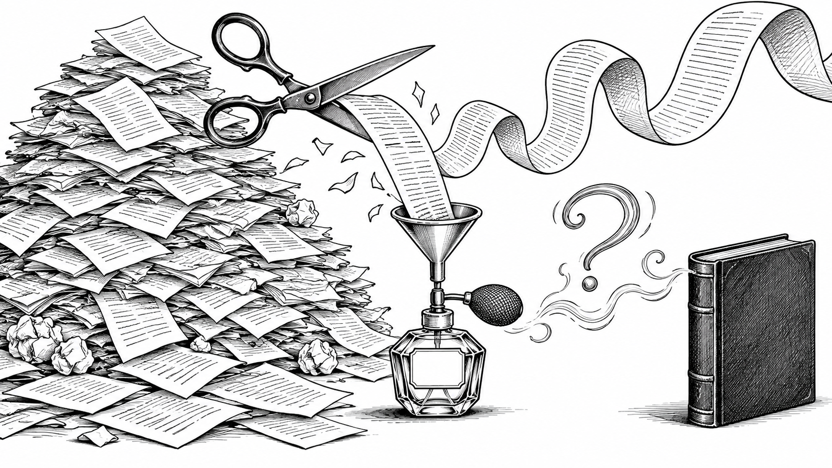
A handsome chapter ornament cannot correct inconsistent spacing. An expensive cover cannot prevent words disappearing into the binding. Perfume remains an ambitious substitute for washing.
The aim is a book whose presentation earns trust and lets the reader settle into the story. Keep the clean master, work with tools you can control, check the consequences of changes and treat each edition as something a person will actually use.
You finished writing the book. Now make sure the object carrying it is equally finished.
The reader should lose sleep over what happens in chapter eight. Not over where you have put it.