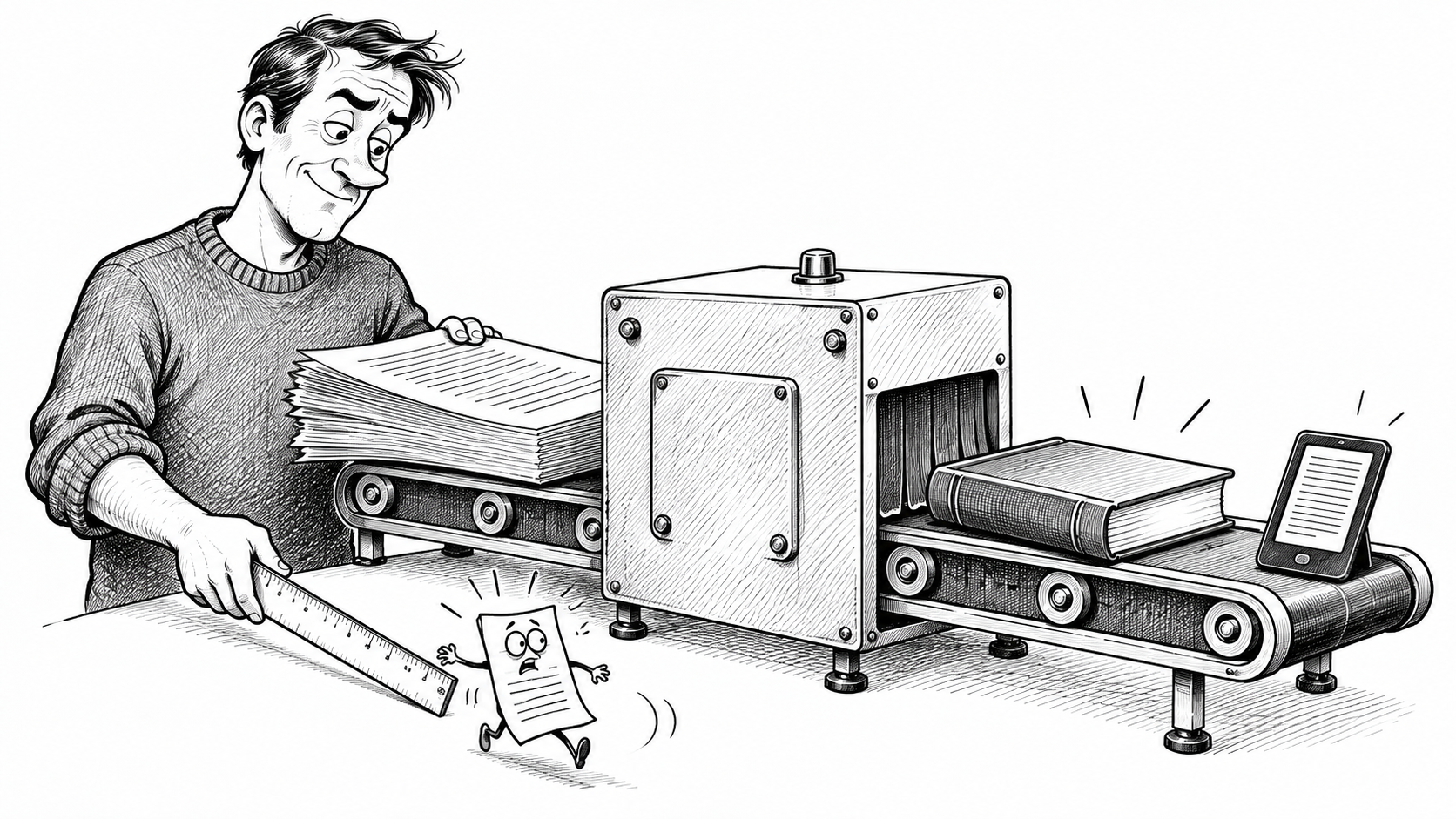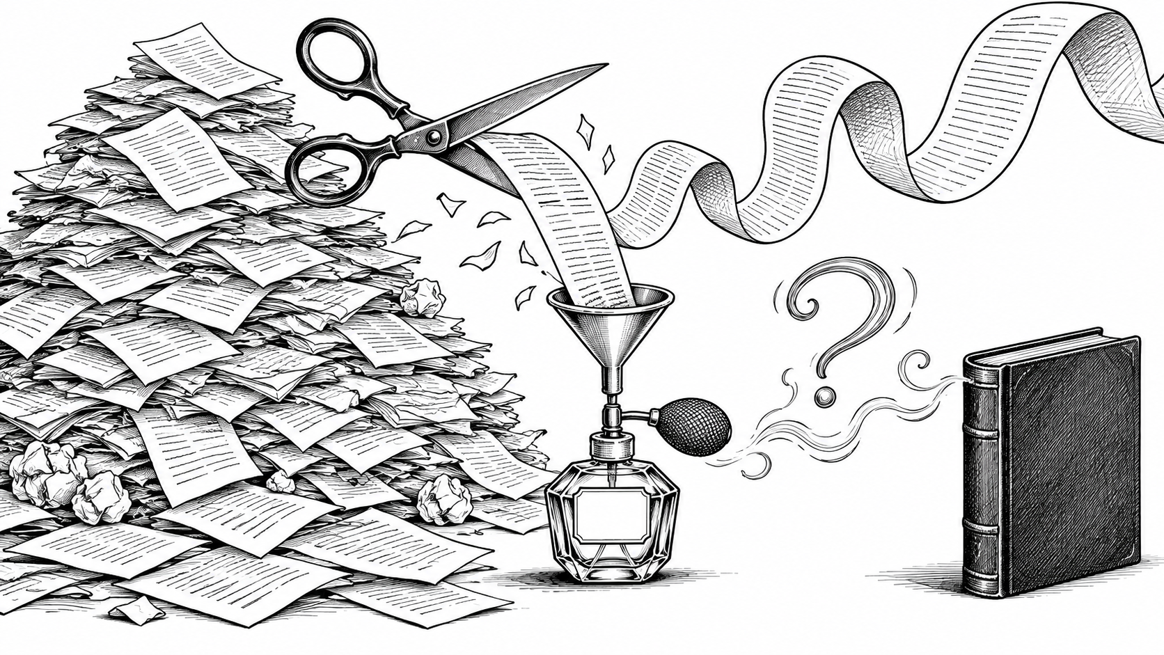
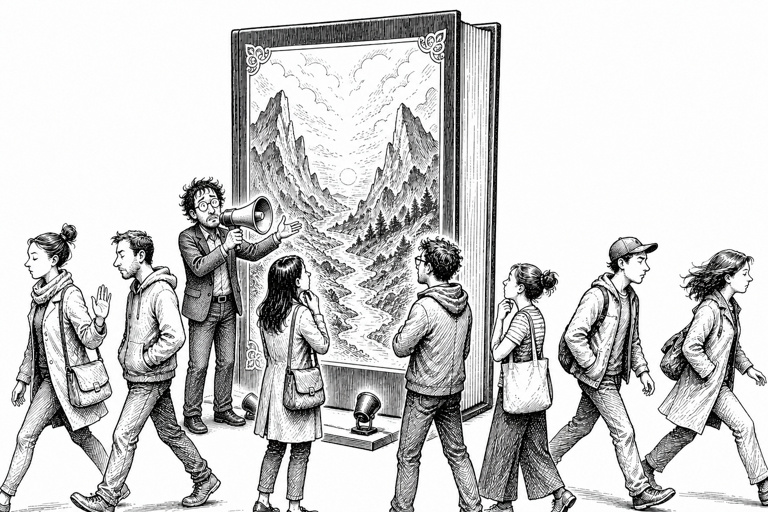
A reader can dismiss in two seconds the book you spent three years writing. It is not fair, profound or especially literary. It is simply Tuesday on Amazon.
Before anyone reads the blurb, admires the prose or discovers the exquisitely foreshadowed incident involving the cellar door, they see the cover. Usually they see it very small, beside several hundred other covers, while spending roughly the price of a latte and behaving as though they are appointing a new head of state.
Your cover is therefore not decoration applied after the important work. It is the first piece of marketing most readers encounter—and it may be the only one they permit to finish its sentence.
Recognition comes before originality
A cover’s first job is not to be unique. Its first job is to be recognisable.
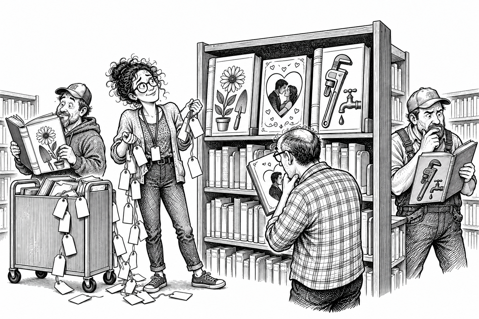
The intended reader should understand the genre before reaching the blurb. Crime, romance, horror and historical fiction all have visual languages: choices of imagery, type, colour, composition and emphasis that quietly say, you are standing in the right aisle.
That does not mean photocopying the neighbouring bestseller and changing the hat. It means understanding what readers use as shorthand. Familiarity reduces uncertainty. A new author may dislike the idea of resembling other books in the category, but readers are not browsing in search of an intellectual escape room. They want help identifying the sort of experience they already enjoy.
A cover’s first job is not to be unique. Its first job is to be recognisable.
The trick is to speak the language of the genre without becoming wallpaper. Recognition first; distinction immediately afterwards.
The author may be too close to the book
Authors often want literal covers. A lamp appears in chapter twelve, the heroine owns a green scarf and an important conversation happens beside a boating lake, so naturally all three must be represented with forensic accuracy.
The problem is that nobody browsing the book possesses that context. An image whose cleverness becomes apparent only after page 317 has missed its first appointment.
The cover must work from the outside in. It needs to transmit genre, mood and promise to a stranger. The author is working from the inside out, surrounded by details that already matter deeply. Those are different jobs, and occasionally they need to be separated before the green scarf acquires its own lighting budget.
The thumbnail test is hateful and necessary
A cover can look magnificent at full size in Photoshop and collapse into digital porridge when reduced to retailer size. This is frustrating because it arrives just after everyone has congratulated themselves.
But most readers first encounter the cover as a thumbnail, so the thumbnail is not a minor technical version. It is the front line.
What must survive is not necessarily every word of the title. Retailers normally display the title beside the image anyway. What must survive is the mood, the genre and the visual hook: enough information to stop the scroll and prompt the tiny but commercially important thought, what’s that?
At thumbnail size, the title can have assistance. The mood and genre cannot.
Typography is not something placed on the cover
Typography is part of the cover.
The title treatment, author name, spacing, weight and placement must belong to the same visual world as the image. If the artwork says psychological thriller while the typeface says children’s party entertainer, the reader notices the argument even if they cannot explain it.
Amateur covers often reveal themselves here. There is an image, and then there is some text sitting on the image as though it arrived late and could not find a chair. A professionally designed cover integrates both. The font does not merely report the title; it helps communicate the book.
Test it after the initial excitement has gone home
The publisher behind this site has spent three decades writing, publishing and designing books. One of his tests remains resolutely unscientific: when a cover first comes together, does it produce that small chill of recognition—and does the chill return tomorrow?
Leave the design. Come back later. Reduce it to thumbnail size. Place it among competing books. Ask whether the genre still reads instantly and whether the image still has force once the thrill of having finally finished something has worn off.
Seek opinions where useful, but ask people whose opinions connect to the task. Someone who never buys books is not a focus group. They are a relative standing near a kettle. Readers of the genre, publishing professionals and properly detached testing services can reveal whether the design communicates what you think it communicates.
Series covers need family resemblance
A series benefits from shared typography, layout logic, palette cues or other repeating elements. Readers should be able to recognise that the books belong together without requiring a family-tree diagram.
That does not mean producing identical twins. Each cover still has an individual sales job, and any volume may become a new reader’s entrance to the entire series. This creates a halo effect: a strong cover on book three can send someone back to book one.
Established authors can sometimes let their names do more of the work. New authors cannot. If your surname is not yet functioning as a retail department, the cover must carry rather more of the furniture.
When should you redesign?
Not every disappointing sales week is a cover emergency. The title, blurb, reviews, price, positioning and simple lack of visibility can all be involved. A redesign should follow diagnosis, not panic.
Prevention is better. Test hard before publication and be willing to change direction if the design no longer feels right. The publisher behind this site has changed covers at the last possible moment—and, on occasion, just as publication was happening—because the finished design did not represent the book or its genre properly.
Changing one cover inside a series also has consequences. A sudden new visual identity can leave the shelf looking as though three unrelated families have been forced into the same Christmas photograph.
Access to the tools is not design judgement
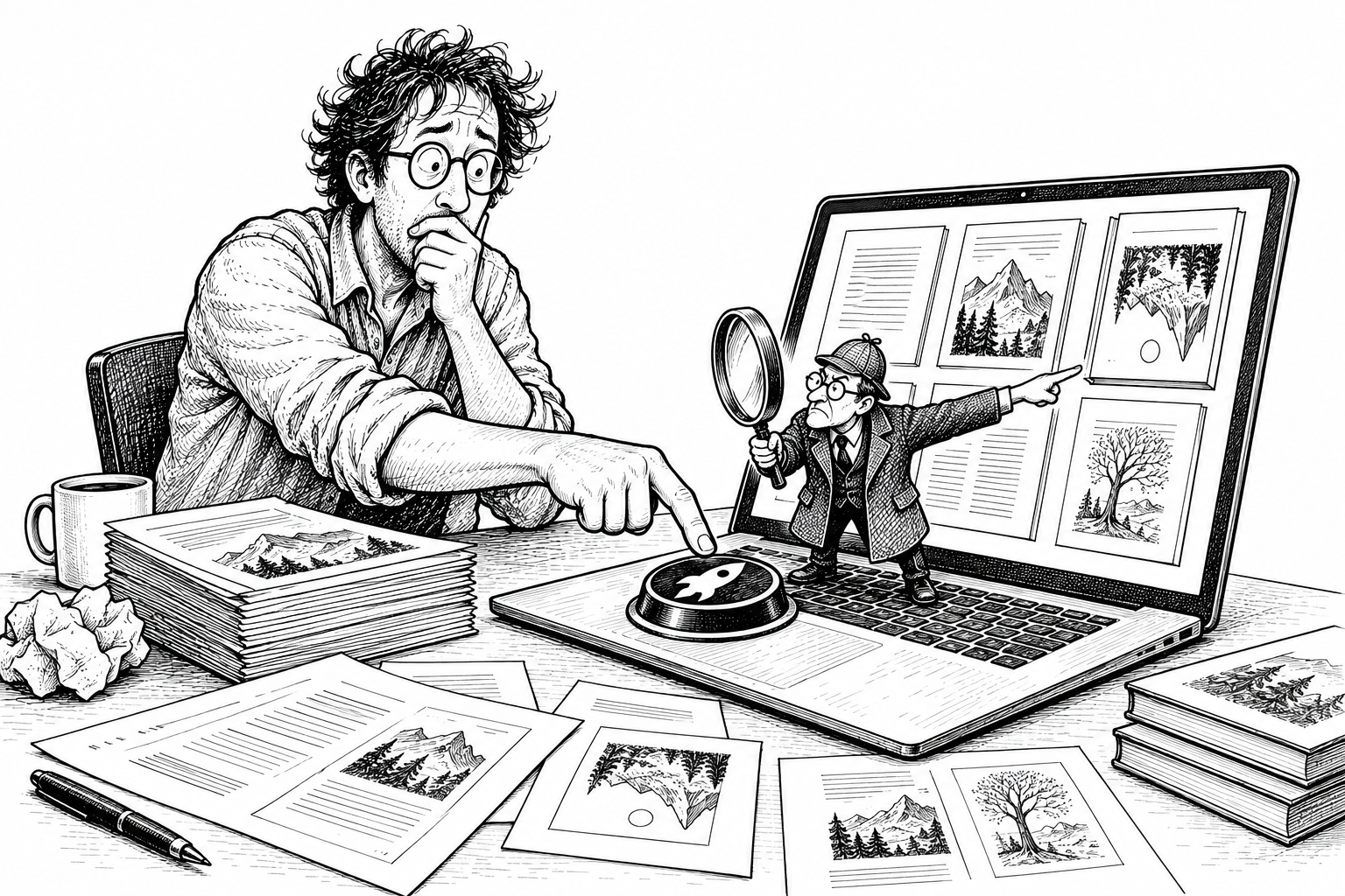
Templates, stock libraries, Photoshop and generative AI have made it possible for almost anyone to manufacture an image. They have not made almost everyone a book-cover designer.
AI-generated does not automatically mean bad. Generic, unfinished and badly directed imagery is bad. The same is true of conventionally sourced imagery. The question is whether the finished cover does its marketing job.
Learning the tools can be valuable, particularly if it teaches you how covers are constructed and how to brief specialists properly. But knowing where the shadow button lives does not mean the title needs a shadow.
Technology gives you access to the tools. It does not give you the judgement to use them well.
The safest rule for a new author is therefore brutally simple: if you are not a book-cover designer, hire one who understands your genre. Do not improvise the first and most visible part of the book’s marketing after taking the manuscript itself seriously for years.
Your cover does not need to explain the entire novel. It needs to make the right reader stop long enough to discover that a novel exists.
Continue the publishing journey
A strong cover is one piece of the much larger operation that begins after the manuscript is finished. Start with So You Finished the Book. Now What? for the wider map.
The cover and the words beside it should make the same promise. Try the worked blurb example and short starting template, then see cover examples across different genres.